Overall I am proud of my product, I liked how the picture is above the Empire sign which is normally used in magazine covers. Also it looks professional than previous covers I've done.
I used red because Empire usually used red and that's the only color which fits both the genre romance drama as it can connotate love and blood in the same category. Also red is used on Empire magazines which ticks two boxes. The blue I have used because black font colour has negative connotations which makes blue the next colour I can use which can connotate to calmness and soothing.
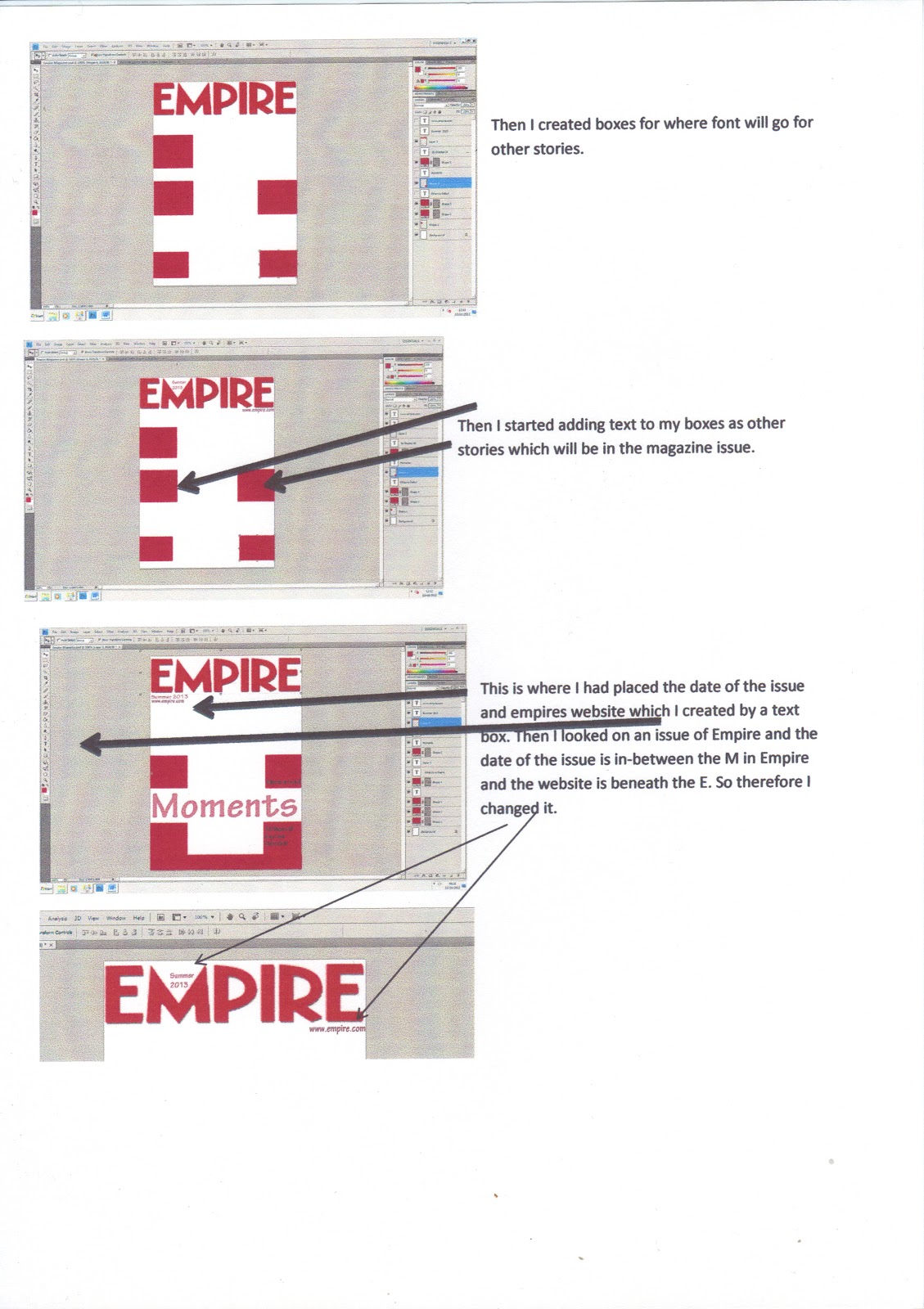
I chose a white background because it makes it look professional and white is the same synergy used in the promotional poster and trailer.

After having a look at my magazine cover and showing my teacher. He suggested to change the font to make it look more professional.
So I changed the fontto Beatnik SF and shrunk the sizes to fit. Here is my final magazine cover.