Evaluation
In what ways does your media product use,
develop or challenge forms and conventions of real media products?
In the
production part of my coursework I have developed and challenged real media
products. My media products are a trailer, magazine cover and a promotional
poster and the genre was a romance drama.
Beginning with
the trailer ‘Moments’, for planning I have developed the idea of happy scenes
verses sad scenes within in a trailer. As I have looked at many other romance
drama trailers like ‘The Vow’ and ‘Dear John’ There were conventions that all
romance dramas had these opposition scenes. In moments I had my leading actor
create scenes which fits the romance mood for example slow dancing then
followed by crying scenes. This was effective because it showed my genre
throughout my trailer, which is how I wanted my trailer to come across to the
audience.
Another
convention which I have developed was how the trailers always starts off with a
high point which is supposed to show the
audience the romance side then slowly changes into drama which shows the
dramatic side of the genre. As I looked at a real media product for example
‘The Vow’ which starts off with Rachael McAdams and Channing Tatum’s marriage
ceremony. I started my trailer off with a intimate dinner date where James King
my male leading actor breaks the ice with a joke about James character being
Batman. As I have seen in many romance drama trailer jokes used to break the
ice between characters as well as show how their love is fun. The romance at
the beginning is supposed to establish the genre straight from the beginning as
it attracts my target audiences who mainly will be females to be interested in
my trailer from the start. I feel the one liner was very effective as it made
everyone I showed chuckle for example my class when I showed. The romance scenes at the beginning were
effective as it set the scenes for the trailer and to happily bind the
narrative for the audience.
Having a drama
moment in the trailer is also important in the conventions in a romance drama
trailer. As seen in Dear John one of the real media products I used to draw
conventions from, I found out that the dramatic moment in the trailer really
sets out the narrative. In many other romance trailers I have seen happiness at
the beginning where nothing is wrong in the couple’s life then at one point
drama comes through to the genre. This is very important to the audiences to
know that this is a romance drama genre trailer. ‘Dear John’ has Channing Tatum
leaving for the army. This point in the trailer showed the problems arising in
the film. In my trailer I had my male actor starting to become ill, with shots
of coughing blood and panting point of view shots. It was vital to have shown
my audiences the barrier between both genre’s as I am doing a hybrid genre. This
was very effective as it showed physical proof of drama arising in the
narrative. I used Todrov’s theory to help me figure out there needs to be a
disruption for the audience to understand the drama part of my trailer.
Then onto the
promotional poster, I also looked at real media products which helped me
develop my promotional poster. The promotional poster ‘P.S I Love You’, I drew
out conventions that a promotional poster need. I drew out that a promotional
poster needs to show intimacy between the characters through proxemics. As
Gerald Butlers and Hilary Swank characters are lying down their proxemics is
close which portrays the message that the characters are close which connotates
love. Also on the ‘Dear John’ promotional poster, it shows Amanda Seyfried and
Channing Tatum together sitting on the beach where their proxemics is close
too. This is where I developed the idea of my two characters back to back which
shows their intimacy and Alisha the female lead looking up at James which shows
she’s in love, however I challenged the idea with James looking away from her and
having his eyes down. I wanted that to portray the hybrid genre on the
promotional poster and to let my audience know this is a full on romance drama
film. I think it was effective to show the romance between both characters.
However it would’ve been more effective if I had both my characters kiss as in
a cheek kiss which comes across as sweet love to my audience. As both my
friends were helping me in my coursework, it would’ve been awkward so overall I
am pleased with my final product.
I also noted
down that the colours used on promotional posters are important. So I developed
the idea from real media products like ‘The Vow’ where the colours used was
pink, and white which connotates love, romances and innocent love. Also the
white connotates fairy-tale like love which is what teen females are
stereotyped to want in love Also it connotates heaven like love. Then I developed the idea of using pink and
white and grey in my trailer. The grey I used was only used because the pink
font of the institution wasn’t readable so therefore grey was used. As black
has negative connotation, I chose light grey instead. Also the pink and white
has the best connotations for my romance in my trailer and promotional poster.
Another point for using grey and pink was that as my trailers genre is a
romance drama, I wanted my colours to show the genre too. The pink was for the
romance part and the grey was for the drama side. With the magazine I used the
colour dark blue and red which was used to connotate romance with the red and a
bit of drama too. The dark blue was only used because I didn’t want to use
black as it has negative connotations. I feel that my promotional poster was
effective as it came across as a romance drama film and had its soft
connotations to it. However overall I don’t think my magazine cover wasn’t
effective as it didn’t look professional enough. The red and blue look too
bold. Generally on a magazine cover the colours are supposed to flow together
whereas I think mine don’t. If I was to improve my work I would have a look at
different colours which work together on a page.
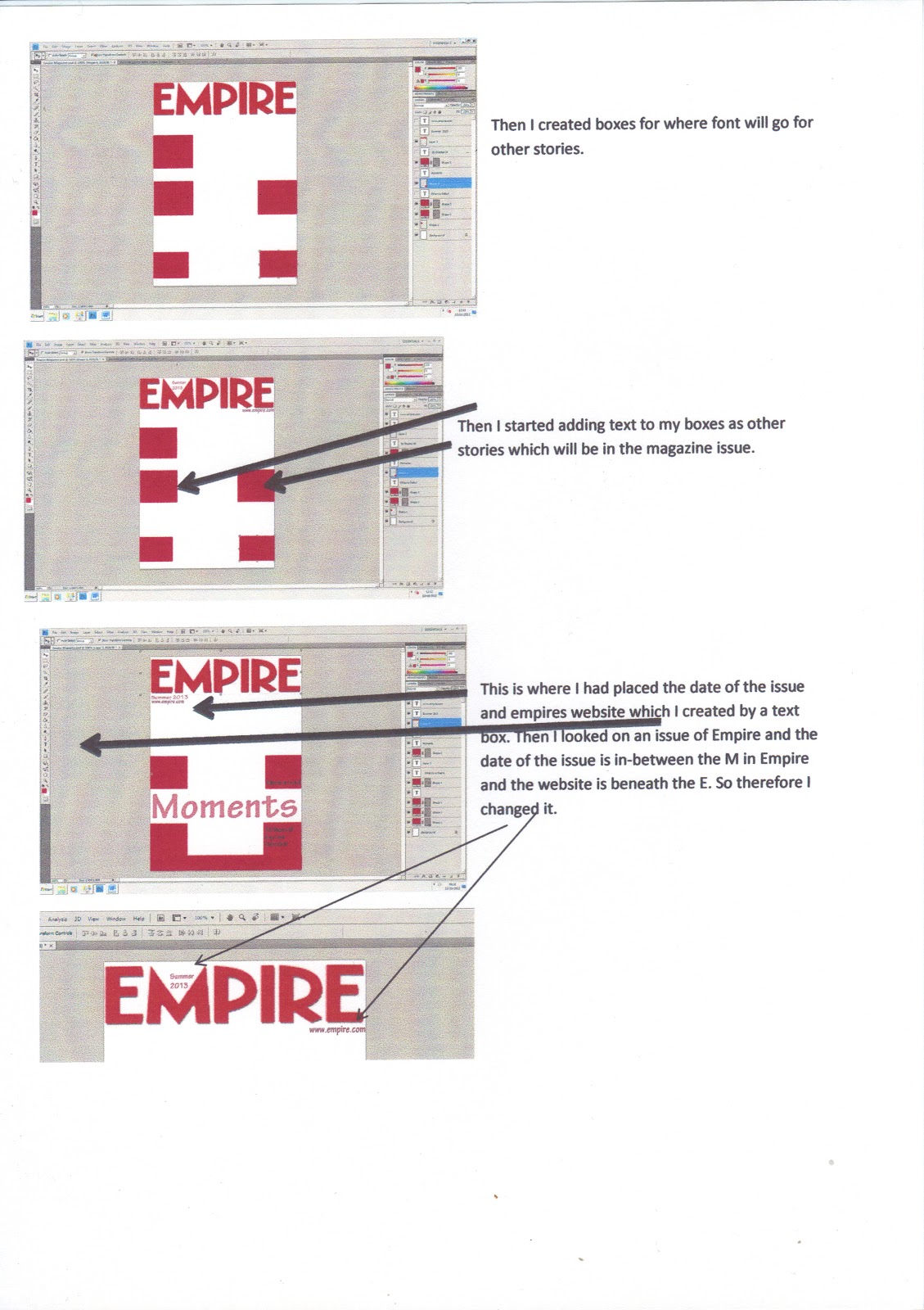
The magazine
cover was the hardest as they aren’t directly for genre films, so therefore I
used the conventions of a normal magazine cover where I adapted it for my
romance drama trailer. I looked at other magazines to see the conventions which
were used like titles, sub heading and puffs. I made my own decision with having no pictures
on the front of the magazine cover due to editing issues which made the
pictures look out of place, so therefore I only placed font and no pictures. I
thought it was more effective as it made the stories stand out and make my
readers read each of the insider stories. However I could’ve improved it with
an outline for all the insider stories surrounding the main image which allows
pictures to be inserts so that they don’t look odd.
How effective is the combination of your main product and ancillary texts?
All my
products have an effective combination of synergy which is the main point of my
coursework.
My trailer and
promotional poster have synergy of the colour scheme which shows the throughout
my genre, each product with the colours pink and white due to its connotations
such as fairy tale like, young love with the pink. The hegemony of heaven is
where good people go and that’s where love is set there forever. It was
effective at the end of my process because colour is very important to a trailer
and promotional poster which establishes the genre and from audience feedback
they automatically think of a romance drama film.
Also the
photos and the acting also represent synergy as they are a part of the synergy.
Romance and drama shown on the promotional poster and in the trailer also shows
synergy with happy scenes and dramatic scenes. This was effective as its proof
of my genre back to back in a scene also it shows the narrative of my trailer
very well.
At the end of
the trailer, there’s institution information shown on the trailer which has the
same font , font size and colour as the one used on the promotional poster.
This creates synergy to show that both of these media products are connected
with the font. This was effective because it showed the links between both
products.
Also the
institutions used are very well known institutions which allow the audience to
understand that this is a good film backed up by the trustworthy ‘Universal
Studios’. ‘Sony’ was used in the ‘The Vow’ promotional poster. I felt that as
Sony is a trustworthy brand and the positive point is that ‘The Vow’ used it
too on their trailer and promotional poster, I had to use it on mine so that
the audience can recognise it from other romance drama promotional posters.
The
inspiration of the Facebook and Twitter address at the end of my trailer and on
my promotional poster was from ‘The Vow’, as most of the audiences will find
information from democratic social sites like Facebook and Twitter. This was
effective as it gave my trailer the current trend as mentioned before most of
the audience members check information online and want the current and new
information for the film.
Onto all three
media products which are the magazine cover, promotional poster and trailer, all
three have effective synergy with the actors used. As both Alisha and James are
the main focuses of my products. As the trailer is about them, the promotional
poster has a picture of them and the magazine has the fun element of their
relationship. I feel that you can establish a great combination between all
three products due to the main image and the focus on the characters. As the
magazine cover is the fun element where both characters are back to back, this
is supposed to show the fun element in romance. In comparison to the
promotional poster and trailer, this is where romance and drama is shown to
attract the target audiences to the main promotion. This was effective as they are the key to my
project which identifies the synergy with my products.
On the
magazine cover and promotional poster, the use of colours worn by the
characters was chosen purposely. Alisha wearing pink was to show how their love
is still a young love and it hasn’t reached that point where romance has
matured together. James in white was to show how innocent their love is. The
pink tie is also used to show how their love is mixed with the young love and
innocent love. In the trailer the colours used were for a reason. In the
production of planning, I made sure in each happy scene no dark colours were
used and in the drama scenes only dark colours were used to portray the mood
and feeling of the trailer. I feel this was effective as the clothes worn by
the characters are a projection of the mood of the scene and the mise-en –scene
of the props is vital so therefore I feel the purpose planning of coloured
clothes was effective.
How did you use media technologies in the
construction and research, planning and evaluation stages?
At the
beginning of the research stages, as a class we used Blogspot.com which is the
blog site where we displayed all of our findings on the blog which we created
ourselves. My own address was www.poojadholakiamedia.blogspot.com
where we updated everything we did, for example notes in class we made about
our product. Also I looked on You Tube and IMDB.com for romance drama films to
figure out the conventions. Researching using Google and IMDB to find romance
drama promotional poster and used Google to find examples of empires magazine
covers. This was useful as I looked at
previous successful romance drama media products as it gave me an outline to
work too.
I even went to
the extend to time watching many romance drama films to help me figure out a
great narrative. I watched A Walk To Remember, The Vow, Dear John, The
Notebook, P.S I Love You. Then some Rom Com like Think Like A Man and A Little
Bit Of Heaven. Although all these were in my leisure, I felt that I was
researching and experimenting different narratives. As I went on the quote from
The Vow- ‘How can you look at the girl you love and tell yourself it’s time to
walk away’. I based my whole narrative on that quote. I felt watching all the
films gave me an effective narrative as it was heart-breaking as well as
romantic.
For the
planning, as shown on my blog, I conducted storyboards which contained what the
scenes will be like, what props will be used and what lines. I also created a
mise-en-scene list which contained props, lighting, and setting for what will
be used in my trailer. I posted all this information on my BlogSpot address for
my coursework. Also I hosted interviews
with my target audiences which I conducted using my video camera, also hosted
focus groups with some of my friends who are my target audience and conducted
questionnaires which again for my target audience.
For the
evaluations I also used BlogSpot to show what my class mates said about my
trailer where my teacher screened out trailers for peer assessment on our
trailers. We each wrote down stars and wishes for the trailers and then wrote
an entry for the blog to show what their response was and how we responded to
it.
I also posted
a blog on self-evaluation where I wrote all my thoughts about my trailer and
what I thought I could improve on. I posted another blog where I wrote down all
my issues with filming which narrows down what I needed to do and what had
problems.
What have you learnt from your audience feedback?
Audience
feedback is very important in my media projects as it shows that I have met or
not met my audience’s feedback. I began with creating a questionnaire which
gave me primary research on my target audiences. I created 10 and gave them out
to friends which were my target audience of females. Alongside I offered my
questionnaires to males as a challenge to see whether I could attract them as a
target audience. 10 questionnaires gave me a wider knowledge of what females
want to see in my media product. In my blog I analysed my information gathered
from my target audience. I learnt that many factors which were requirements,
for example the importance of colour of soft colours like pink and white and
the setting of the scenes in my trailer. As I analysed my information it made it
easier for me to plan my scenes and magazines and promotional poster out. I
made use of the colour scheme and the main picture being the main love
interest. I think it was successful as it gave me an idea of what scenes and
colours to use as it came straight from my target audience. Overall the
questionnaire was helpful, however as outlined in my blog, the questionnaire
was biased as I asked mostly females and less males which can be a reason to
why many single males weren’t attracted to my media products.
Also
interviewers were conducted, I conducted four interviews which are all on my
blog. Interviews allowed me to elaborate points made from my target audiences.
As I interviewed a couple, two females and then one male, it allowed me to know
what they expect from my media products. As the interviews were in depth I felt
that I could gain important information such as having bright colours and
having enigma codes as its vital for my media products to have the audience
input. Also I wanted to see my target audience recognise my trailer for what
genre it is, which I feel it does follow the conventions which I think have
conducted and done to the standards of my target audience.
I also conducted
a focus group with a group of friends to ask questions about what factors
should be seen in my promotional poster. I created a video of my focus group
which is posted on my blog which includes the feedback. As my focus group was
mixed, I got a feel of what they were looking for i.e. what fonts to use and
what images should be used in my romance drama promotional poster. I got great
feedback with a range of answers and opinions and views on settings of bright
coloured backgrounds and having the main image of the main couple. I analysed
this information and used it to my advantage which is why overall my
promotional poster followed the conventions set.
When my
trailer was complete, my media teacher showed them in class for peer assessment
with my class. I got a range of feedback which I posted on my blog such as,
good use of soundtrack, good use of colours and good acting. However I have had
criticism with the use of creating my own billing card. However to justify why
I created my own was because I wanted it to make it my own work and I didn’t want
to copy another one and I wanted to prove that this would make my work look
more professional as I created myself. Also another criticism was to use a
range of music in my trailer. I was advised by a few to use a range however I didn’t
use a ranges as I was following codes and conventions of a romance drama
trailer. As I am doing a hybrid genre, I only used two scores to fit with the
scenes, so therefore I didn’t follow the advice of some of my peers. Another reason
as to why I didn’t change was because the advice wasn’t from my target audience, so
overall I didn’t want to change anything which doesn’t appeal to my target
audience.
Lastly I
showed my media teacher my finished trailer, it was very helpful to get great
feedback on what was done well i.e. good use of camera angles and colours. Also
my teacher gave me a change to conduct, which was in a scene where one part of
the dinner shot was a jumpy shot. I put that shot of James laughing to inform
the audience that they are laughing which is a key factor in a couples romance
and first date. However I understood why my teacher pointed the shot. As she
was a target audience I felt that it was a necessary change so therefore I cut
the shot out as they were holding hands. Overall I feel it was a successful cut
as it gave the aspect of innocent and cute love of both characters holding
hands.