Friday, 24 August 2012

Magazine Analysis- Total Film


On the cover of this issue of Total Film there are many colours used in this issue for example, with the gold used in the masthead, the title and the belt of Batman. This gives the cover its own batman touch. This is very effective as this allows the readers to be familiar with the issue as it resembles Batman’s colours.  Also it gives the front cover a themed look as all magazine covers are themed which makes them look more presentable and neat. I will be using this themed look on my magazine cover as this allows me to understand the main reason for a successful magazine cover. With the background colour of black contrasting to blue, it connotates a dark/ negative theme. Kind of like a twilight zone. With a contrast of black from the night before through to the blue for the upcoming day. With the use of the twilight zone themed background, it fits perfectly with Batman character as this is when the Batman is out conducting his job to save Gotham city. This allows the audience to have a sense on what this issue is about also again has a professional sense to the issue too. With limited amount of yellow on the cover, this allows the readers to be attracted to the cover where there’s only two words which are in yellow. With ‘EXCLUSIVE’ and ‘Christian Bale’ in yellow, this indicates to the audience that this is key information. With the use of limited amount of a specific  colour yet bright can attract the audience to key information. In my own magazine cover, I will be using this idea of highlighting key information to indicate to my readers.
The only main font I can pick out is the main title of the cover. How the Dark Knight Rises title is straight yet close together resembles the font Agency FB . The use of the long font can be metaphorically connected to Batman as a character who is tall and dangerous. Also due to the closeness of the font, this also connects to Batman as Batman is quite swifty and can camouflage in the darkness. I personally feel the closer the font is, the better it represents Batman as a character.
With Batman jet black suit on Christian Bale, it stand out on the magazine cover. The suit has alternate meanings for example, the dark knight, mysterious, hiding a secret. With many more connotations for the audience to figure out, the suit was used to promote the film. Total Film could’ve had Christian Bale in his Bruce Wayne outfit rather than his Batman outfit however due to the audience knowing who Batman is with one look, this would attract the reader to the issue of Total Film.
Language on the magazine cover is very simple and straight forward. It is essential for a magazine cover to have very simple and straight forward language.  With words like ‘Exclusive’ and ‘Essential’, this engages the audience to the cover. With the word ‘Exclusive’ readers feel like the magazine are letting them in on exclusive information. To allow reader to feel important is the main aim from magazines as they need to sell their magazine. In my magazine cover I will be using engaging words on  the cover which should engage my reader about my new film.
Layout is very important on a magazine cover as it follows a template. With the masthead of the magazine cover which is at the very top of the cover. This is essential as this is the very first thing reader see, the name of the magazine cover. As this will be the first thing readers read, you would want the magazines name to relate to the basis of what the magazine is covering. For example as films magazine are ‘Empire’, ‘Total Film’ and fashion magazine are ‘Vogue’ and ‘Elle’. Another reason for the name of the magazine to be at the top is for it to stick in the minds of the readers. Another  follow on is the main image. It is generally in the middle as the main cast of the film. With Christian Bale is the main cast of Batman, he is the main image which makes a statement. With my trailer I have two main casts so I will be using a two shot as this would be changing the template of the magazine cover. With the heading of the main story on top of the  main image, this again is the template of a magazine cover. Whenever I see a magazine cover, I first look at whose on the cover and what the story is about. I automatically have a look on the main image as there is normally an indication of what the story is about. I do feel that that is the best option to have the heading on the main image. Lastly there’s writing around the cover as this is an indication of what else is in the magazine. The writing of the font is smaller as this isn’t the main story which should be attracting the reader. I will also be using the other stories on my cover as it follows the theme of the magazine cover.  However some magazine covers have images on the cover which also attracts readers. I will be making my decision of having other images on my cover when I come to planning it.
 

Monday, 6 August 2012

Analysis of 'P.S I Love You'- Promotional Poster


In this promotional poster there’s a lot of white used in the poster. This is to show the innocence of the characters love. Also it shows purity of their love too with the use of white and as its connotations. Also the sense of nudity shows purity and simplicity in their love as Hilary and Gerard’s characters are bare skinned.
There’s black font used for the names of the actors in the film then for the institutions and other production names. Black has negative connotations such as, death, poison, evil and unhappiness.  I have noticed that the use of black which links in with layout as there’s something happy for example the image then black writing then it’s the name of the films then the institution and production information then the date which the film is released, which is in red. I feel that the black is used to break down the romance on the promo poster. As this film had many dramatic incidents for example, when Gerard Butler’s character dies, I feel that the colour and layout reflect the storyline.
The use of red as in the font is perfectly used as this is a romance drama film. The red portrays the love in this film. A darker red is used which shows the audience that their love is deep and longing and forever. However red also connotates death, this could mean death as this film had part death involved in the narrative. This also could show the loss of her love in the film and the simile of her blood lost as her love is gone.
The use of 3 main colours contrasting of a majority of white to red and black shows that this film is mainly about the purity of the romance in the film with some inserts of pure true love which is connotated with the red and then the breakdown of the romance with the drama from the black used.
Lastly, black font is used for the names of the actors then for the institutions. Black has negative connotations such as, death, poison, evil and unhappiness.  I have noticed that the use of black which links in with layout as there’s something happy for example the image then black writing then it’s the name of the films then the institution and production information then the date which the film is released, which is in red. I feel that the black is used to break down the romance on the promo poster. As this film had many dramatic incidents for example, when Gerard Butler’s character dies, I feel that the colour and layout reflect the storyline

The main title of the name of the film on the promotional poster is written as someone writing it. It mirrors the whole narrative of the film as Gerard characters leaves letters for Hilary’s character. It can also stand for when people write ‘P.S’ at the end of letters or emails. They are quick and a short little message. The film promotional poster reflects the idea that the name of the film is very romantic and how the little message contains those three words a couple crave for.
The size of the font is different. With the name of the film in big font, this allows attention to the films name as it stands out from all the information on the poster. Also coinciding with colour, the date of the release is also in red and in block writing which again stands out from all the institution credits from the bottom which stands out to the viewers.
The fonts for the actors names and the institutions are in simple font and very straight. I personally think that this font was left simple so the audience get more attracted to the films name. As colour is involved this again attracts the audience. I think that that is a great way to attract your audience using the promotional poster. By using a different font for the name of the title and using a simple yet normal font for the actor’s name and institution credits. I will think of this idea and try to imply it on my promotional poster.


The image is the first thing that audiences notice from my survey I have conducted. This is normally the decider on if the viewer sees the film. As ‘P.S I Love You’ has a close up on the two love interests of the film, Hilary Swank and Gerard Butler. Normally on romance drama posters, there’s a close up or a mid shot of the two love interest, this is used so that the audiences know the whole film will be about them. The image is an iconic moment in any couples relationship. In films and now books we see/ read the male love interest propped up on his elbow whilst the female love interest shy’s away whilst lying down. By portraying this iconic image through the promotional poster, this attracts mainly females to the poster as it is an iconic moment in a relationship, which many girls would love to be in that position with their other half.  The proxemics of the image is very close, this is a code and convention for a romance drama poster to show on the promotional poster to proxemics of the two love interests as overall this is a romance drama film promotional poster.

Normally the layout of a promotional poster is the same. With the main image on most of the poster and have the name of the actors below the main image then the films name then a slogan then institution credits at the bottom. This layout is like this because normally the first place the viewer look on the poster is the top or the middle and as the main image is in those places, the viewers will know who the film has. With the writing at the bottom of the page, and the title in the middle of the writing with big font which stands out also attracts the audience in at one glance to know who’s in the film and what the film is called. With the set format, the audience don’t want changes to the promotional poster as this means they won’t know where to look first. If the institution credits were at the top and the main image was at the bottom of the page, the audiences would be looking at an odd poster as it wouldn’t be effective enough. That’s why I am going to follow this layout in my promotional poster as I think it is effective to give the audience to right information.

Language on a promotional poster should be limited as the main image should be making a statement rather than language on the poster. As the title is very simple with, ‘P.S I Love You’ the genre of the film is easily portrayed and with the simple word, the film is remembered. With simple words used on the poster, allows every viewer to understand what the film is about. As a promotional poster is normally what audience members see at cinemas alongside trailer, they need to fully understand the language on the poster. If there were complicated words on the poster, audience wouldn’t be attracted to the poster. With word like ‘P.S I Love You’ it is very easily portrayed that the film is romantic with the three iconic words as part of the film name. The slogan portrays a romantic mood across the poster, which attracts audience of the romance drama genres. I will use very simple language on my promo poster as I only want to portray the films name and have a small yet a snappy slogan.

Tuesday, 31 July 2012

Finale Script

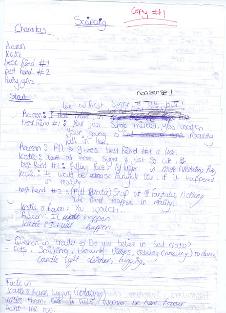
This is my finale script, this has the script which the characters will be using and then has some camera shots/ angles I will be using in specific shots. At the time of filming I will try the projected shot I have already written down. If they do not portray the shot I want, I will change the shots to a suitable shot and try make it varied too.


Scripting- rough #1

This is the first rough copy of my script. this gives me a guideline of what i want to be said in my trailer. As trailers should not have long scripts as a trailer should attracts audiences to
the film. I have made 2 other copies of my script, however I feel that my first copy should be on my blog and my final copy.


Narrative for Trailer

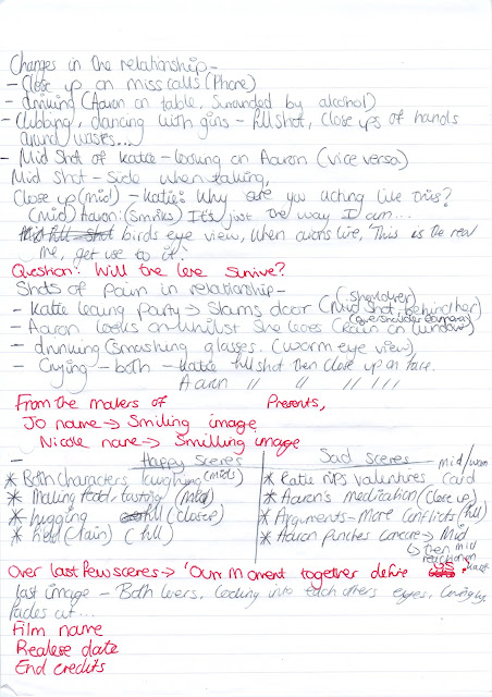
This is my first copy of my narrative and the order of my trailer. This has the least points in what will happen in my trailer. I think it is very important to jot down in order what will happen in the trailer, yes the story board will be uploaded soon however at a start it is very important in pre-production for a limited chronological order of the trailer. 


Then I have my final copy of my narrative, which again I have scanned. This is what I am working from currently. This updated version had the questions that will appear on my trailer which will question the audience and make then active rather than passive, which is changing the audience theories. 


Tuesday, 17 July 2012

Engima Questions in Trailers


In many trailers like, The Vow, Dear John and The Notebook have questions in the trailers. This allows the audience to be active whilst passive. These are part of the codes and conventions of a romance drama trailer. With questions like 'How do you look at the girl you love and tell yourself its time to walk away' 'Will true love survive' allows the audience the have some attachment to the characters. Also it allows the audiences to gain hints from the narrative. Lastly these engima questions allow the audience to start thinking about the storyline and the characters. As a matter of fact, a trailers role should be attracting audiences to watch the films.

In my trailer, I have come up with 4 enigma questions of my own to fit in my trailer.
'Do you believe in soul mates?'
'Would you sacrfice everything for the one you love?'
'Will true love survive?'
'Our Moments together will define us...'
All 4 have been alocated in my trailer which should impact the audience to have the feeling of wanting to know what happens in the film.

Monday, 2 July 2012

Film Trailer Analysis #3- Dear John


Dear John


This analysis isn't as detailed as the other as this blog just points out the main points I should be using in my trailer.
As the previous trailers, I have had the same experience with the Dear John trailer. I watched the trailer and it made me watch the film.
I noted down what happens at every step of the way in the trailer. This is what happens...

·         Icon is shown
·         Establishing two main characters
·         Meeting of main love interests
·         Funny moment between them to show to the audience this is a ‘cute, fun’ film.
·         Have words across for author or director. I.e important information the audience need to know
·         Establish love between characters.
·         Insight of problem
·         Love scenes again
·         Introduce the main problem in the film
·         Scenes of love against sad then again and again. (IMPORTANT)
·         Show words on screen of actors

·         Name of the film appears with the actors last line, which lets the audience think. Like an enigma question.
I figured out from the Dear John trailer is that most definitely I need to show how the two love interest meet and show glimpses of their love. Also i need to show some funny moments as this proves to the audience that they will go ‘aww’ in the movie at the two love interest love moments.
Moreover I need to show insights of the problem that will be arising in the film as Dear John’s trailer has and so does the other trailers and I want to follow a successful convention of romance drama trailers. It makes the audience who are passive ‘active’ when they are thinking and sort of alert if the disruption occurs.
Furthermore I need to add the scene where the love interest are happy and upset back to back. As a code and convention I should be having scenes back to back.