Tuesday 18 December 2012

Finished Magazine Cover

This is my finished magazine cover
Overall I am proud of my product, I liked how the picture is above the Empire sign which is normally used in magazine covers. Also it looks professional than previous covers I've done.
I used red because Empire usually used red and that's the only color which fits both the genre romance drama as it can connotate love and blood in the same category. Also red is used on Empire magazines which ticks two boxes. The blue I have used because black font colour has negative connotations which makes blue the next colour I can use which can connotate to calmness and soothing.
I chose a white background because it makes it look professional and white is the same synergy used in the promotional poster and trailer.


After having a look at my magazine cover and showing my teacher. He suggested to change the font to make it look more professional.
So I changed the fontto Beatnik SF and shrunk the sizes to fit. Here is my final magazine cover.

Monday 17 December 2012

Making My Magazine Cover

Here I have created on a word document a documentation of making my magazine cover on Photoshop.


Finished Promotional Poster

This is my finished promotional poster, I used Photoshop to create this poster. I personally am proud of my project because I have used synergy throughout this poster and the trailer. The colours are soft which are meant to be used on a romance drama film. The actors did really well in the photo shoot and remained in character whilst pictures were taken.


Friday 26 October 2012

Evaluation of My Trailer

This is my blog post where I can evaluate my trailer.

Main intentions
Firstly my main intentions of my trailer was to attract a huge number of my target audience which are females, mostly couples and teen girls.

Showing my genre through the trailer. 
My genre is romance drama and after looking at many trailers and watching the films, I got a sense of the genre. With the shocking moments in the story line which normally defines a romance drama for example when someone has a terminal illness, they are doing something they don't want. Normally it is leaving the girl which in my case is part of the narrative.
 Also referring back to my codes and convention blog, I have also shown my genre through the non digetic score which reflects the feelings/ moods in the scenes.
Also as stated on the codes and convention blog, it is a convention that fades and cuts are used. I have used in the sad and information scenes, for example where my main character Aaron has started to cough blood. Also in previous romance drama trailers, at the very end of the trailer we see the characters name and face where they are smiling, I have conducted that myself in my trailer, which shows the genre off.
I have used Todrov's theory to structure my narrative. I have started with the equilibrium where I have my starting scene where my character are on a dinner date.
Then I created the disruption and recognition of where Aaron starts coughing blood and feels uneasy. Also the two shot where his best friend tells him to let go.
Then the repair was all the quick shots of him doing negative things like drinking, and having the medication.
I added my own piece to the theory which was quick cuts of the love, which I have spread from the start to the end.
Lastly ending it with a few shots of the problem and love, which I have done at the end of my trailer.

Other peoples opinion on my trailer
I have shown many people my trailer, mostly my target audience and have written down what they thought of it.
Natasha- Overall the trailer was put together real nice and flowed very well and understood the narrative. Also the shots that I used was good and were different which was good. Especially the shot in the cupboard where the main character is reaching for his medication. The transition shot was good. Also the shot where the main guy point of view shot was used when he was coughing blood.
To improve on, Try use capital letters for you questions in your trailer.
I tried the improvement and it just didn't fit. To justify I had capital letters for each starting word and left the rest lower case. The reason I have done this is because it gives the words a soft appeal to them and its not like the words are shouting to my audience when they read it. I wanted my trailer to have a gentle approach.
Maira- She thought that the whole trailer fit with the music, it flowed very well, it attracted her from the start and overall she staed, 'if the film was made, she would watch it.'
Mrs Jenkins( Media Teacher)- Overall she liked the trailer, she liked the variety of shots I used including the medication scene transition. Also the lighting in the first scene which allows the mood and sense of togetherness between the couple. However to improve on, she stated that there was a jumpy shot where my main character laughs at the end of the starting scene. I deleted that scene and re arranged the shot and it looked more better and seemed to flow editing wise better.
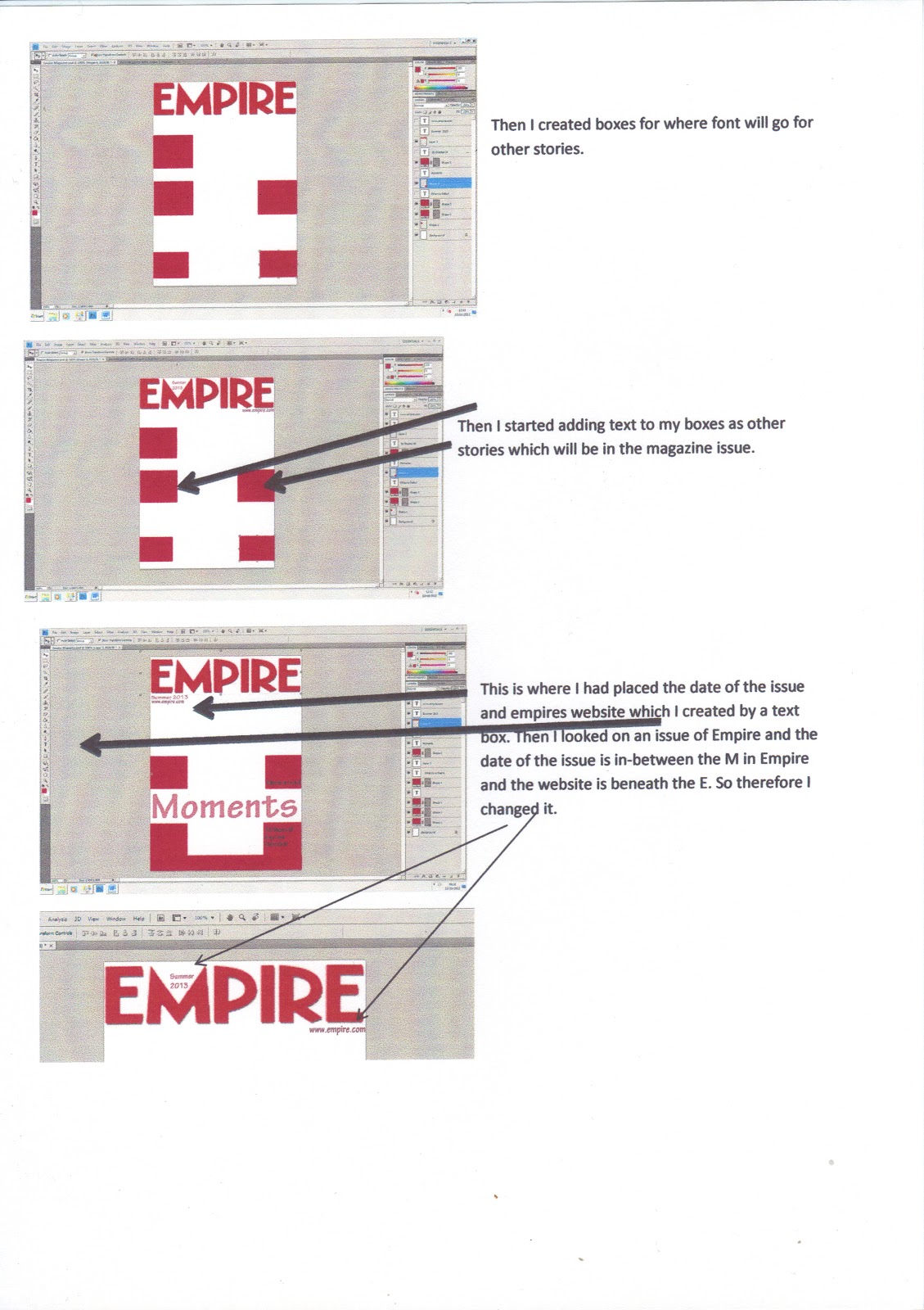
Shweta- Overall she liked the trailer and liked how it flowed and the narrative made sense. She liked the colour scheme I used- White and pink. Also she also liked the lighting throughout the scenes and the colours that the actors were wearing.It fitted with the mood of the scenes and the whole trailer.
Saira- Overall she liked the trailer, she liked how the voiceovers fit with the music with the emotions, also she likes how the trailer interwines with the shots.
Krishna- Overall he liked the trailer, he thought it flowed very well, he liked how the music corresponded and the final voiceover I choose was better than the other one.

My own opinion on my trailer.
Overall I thought it was a good trailer, I understood the narrative however that would be very biased of me to say as I know the narrative inside out. It flows the way I wanted it to. At the start of using Windows Live Movie Maker I was doubtful in editing my footage in the programme due to the lack of other effects I could've done. I thought that my trailer wont look professional enough... I was proven wrong.
Windows Live Movie Maker has done a great job and in fact the fancy effects weren't needed in a trailer as you just needs basic fades and cuts and simple transitions. Onto the simple shots and  the ease of editing, it did establish the characters and location the way I wanted to. I am thankful to my actors who have I have moaned constantly on getting the filming done and they have done a tremendous job on acting in very awkward situations.
However one thing I wish I can improve on  is that I wish I could have done more happy vs sad shots. It seemed my trailer started with all the happy shots and ended in sad shots which wasn't the way I wanted it to end with. However with the slow motion hug at the end I hope that has recovered that issue.


Thursday 25 October 2012

Finished Trailer

Here is my final trailer, I have worked very hard on this and trying to make it a good and understandable trailer. I have created two trailers which haven two different voice overs. One trailer's voice over is my main actor James voice and the other is mine. I am overall presenting my final trailer as James Voice over however I thought I should present my other trailer too.

Trailer#1

Trailer#2


Making My Promotional Poster

Here I have created my Promotional Poster on Photoshop, and I have documented on a word document and scanned it through.


Wednesday 24 October 2012

Font Choosing

Font is very important in my project as it will be a key item for synergy.
On this Word Document I have some fonts which I have considered to use then narrowed down to 3 fonts which I trailed and see which one will work on my project and justified why I liked the particular font.

Overall I went for the Tekton Pro font as it was more visable from a far and it can be fancy and smart at the same


Tuesday 9 October 2012

Response on Promotional Poster & Magazine Cover plans to my target audience

I have showed my magazine and promotional poster plans to my target audience which are females. 

Women #1
Magazine-  Liked the layout, the title was attractive, image was different and good idea for a white plain background also the film strip along the front magazine was unique.
Promo Poster- Liked the layout and how the released date is amongst the institution information, how the actors name is listed, also where the title is on the page, also the location of the tagline, and image.

Improve
The image on the promotional poster, have the actors facing each other and show the intimacy.

Women #2
Magazine- liked the layout and looks likes a proper magazine, colour scheme fits with genre, Also how the image is covering the mag names.
Promo Poster- Colour scheme, actors name location, location where the institution info is, also the image is different which is good as I am not following other romance drama posters. Normally others use actors face close to close but I am going to use another one which is good and makes my promo poster stand out.

Women #3
Magazine- Liked the layout of the magazine name and the writing around the picture, also she liked the image and the colour scheme.
Promo Poster- Liked the colour scheme, good idea about the image which portrays happiness and sadness at the same time. Lastly, the layout of the poster is clear and spacious which allows the audience not to be reading a lot, just giving the main info like release date and actors name.

Thursday 4 October 2012

Institution information on my promotional poster and trailer

I have looked at what is written in the institution information on promotional posters and trailer. So I zoomed on The Vow information and made note of what is included. This will help me in making my own institution info on the bottom of my promotional poster and on my trailer.
I chose The Vow promo poster for this because other promotional posters like Dear John, P.S I Love You were all blurry so I found  'The Vow' clear version.

Friday 28 September 2012

Production/Post Production Issues

Production/Post Production Issues 
I got halfway into filming and had some free time as my actors weren't free, so I started editing when I started editing the footage I got so far. It felt like the narrative wasn't getting through the trailer and maybe I have filmed a too much. That's why I had gone back to basics and written down on paper Todrovs theory which applies to my trailer and matching scene up to the theory. This makes it clear for me to show and structure my trailer.

Then another problem arose where the first scene was too long.  So I had a look at The Vow trailer's first scene and Dear Johns trailer to see their first scene and it wasn't long so I made a decision to scrap my first idea of showing how my two love interest met in the library. I have switched it to where they meet in a Blockbusters. I personally feel that it would be a quick few shots and easier to show my narrative.

Another issue is that my actors aren't free, which delays filming. At this moment I am done
with filming and editing. All I have to do is get my male actor to do voiceovers and then I am done.
.
As I have countlessly explained, my narrative isn't panning out, so as I planned on having a scene in Blockbusters, I decided not to anymore. If I shot that scene,  it would be like if I was making a film, not a trailer. I think when planning the shots, I may have over planned and thought of doing extra scenes as if I was doing a film. 

Monday 24 September 2012

Overall Information on my project

To explain my project,
Genre
The genre I will be focussing on a hybrid genre, romance drama. As I like romance drama films, I feel that I can come up with a good romance drama storyline.

Target Audience
My target audience are mainly females. From the ages 15+. As it is a simple storyline, I feel that most teenagers would like a simple yet sweet romance drama to watch.
I tried to attract a male target audience too, however I feel it is very difficult to have the male audience watch and be intrested in a romance drama. There is something which doesnt attract men to a romance drama whereas it does attract the female audience.
Also the middle aged generation would like this film as it is about young people who have a normal life and have gone through something which can happen to anybody at an instant.
Also I am trying to attract couples as couples normally go see romance drama together and I want my trailer to follow that norm.

Friday 7 September 2012

My Promotional Poster Plans

This is my promotional poster plan. The pencil outline of the image isn't great when scanning, but this shows my two actors faces close to show the intimacy of the characters. I have gone with the idea of  'The Vow' poster. As I will be using a different image to show their love in the promotional poster, I can use another image in the magazine cover to show their love but in a different less intimate way. In this image I wish to use a white/ heaven background as it should show the intimacy. I have followed the trend where the institutions names are at the bottom of the poster which is combined with the release date for the film too, which will be in red to make the date stand out. Majority the image should be the only major attraction on the image rather than the name and that is what I've gone for.


This is my 2nd plan for my promotional poster. The image wasn't decided so I drew 5 ideas on the plan. The layout is different as I placed the film name at the top of the poster then the names of the characters at the bottom. I tired this because I wanted to see what it would look like if it changed.
The use of pink for the title was used because pink is a soft colour which should represent the love of my couple in the trailer. However as this is a synergy project I may use red as I have used red on the magazine poster too and see which one looks better. Also the same colour needs to be used in the trailer too. Overall I don't like the way the film name is at the top and actors name is at the bottom, so therefore I made another plan with what I would like my final poster to look like.


I combined what I liked in the first two posters and created a super final poster.
Again the layout I have followed normal promotional posters that I have analysed. Starting with the names of the actors at the top. I personally feel that it would look more professional and the audience would notice the actors if I have the names at the top. Then they would gradually descend to see the image then the name of the film with its tag line underneath then the institution information and the date of release within the details at the bottom. As I explained with the second idea, I have gone for a pink however I will trial a red as I have used red in the magazine which would show synergy. The image is drawn in pencil and not colour in because I am still hesitant on what image I should use, With the previous shots I will photography all 5 poses and see which one will suit the promotional poster and which one will deliver the right message across on the promo poster. Again with the other font colour I don't want to use black as it has negative connotations, so depending on the background I want to use a beige, creme font.


My Magazine Plans

Here is my first own draft of what I expect my magazine to look like, I have taken into consideration what my audiences expect me to use in this. 


The image hasn't been decided as I want it to fit and look acceptable for a magazine cover. However I have written some ideas for what I could have my main image as, the actors face close, a piggyback ride or the man in front and the women face behind. I am waiting for the photo shoot to decide what final image I shall use on my magazine poster. 
I want the the background to be white however like heavenly with bright lights so I will be finding a way to conduct the background with the colour scheme.
To explain my magazine,
I have chosen the colour scheme, red, black, white and yellow. I felt the red can connotate love in my cover as it is a romance trailer I am portraying. The use of black font is to make the font stand out. Originally I was going to use white font , however as I want a white background, I cannot use white font. With the use of yellow used on the cover, I have analysed from previous magazine covers that yellow stands out on covers which was the reason of use on my cover.
Lastly the use of the film reel at the bottom of the cover, I got as an inspiration from another magazine I Googled. I thought it was pretty interesting using a film reel to show what other stories will be involved in the magazine.
However to look at the overall plan, there's a lot of black used, which doesn't show my genre justice, which means making another magazine plan.


Here is my second draft, having more than one design could prove good as I have two designs to choose from in my finale cover.


This magazine has an image which I would like to use. As this is promoting my film as well as the actors in my film, I felt that a close hug would show the proxemics of the characters in the film and on the cover.
The title is red and the sub heading is red too. I felt that normally Empire covers have some sort of red on and as I am doing a romance drama trailer it fits perfectly with the genre as red connotates love and passion.
With analysing previous magazine covers, I have noticed that the costumes that the actors wear on the cover coordinate with the colour scheme used on the cover. As 'Empire' is in red, I will be having some sort of red on my actors and hopefully use some dark blue too.
My background in the photo will either be a white plain background which metaphorically will be heaven or a background which is blurred out. However font will be a major option. As I want to font to be clear and readable, I feel that colour is also important. As black would be readable however it gives off negative connotation such as evil, dark, mysterious. A dark blue font could suffice as blue connotates calmness and neutral.


Thursday 6 September 2012

Actors

In my coursework i have asked my a couple of my friends to act in my trailer as i can trust them to help me in my coursework.
I have chosen...

James to play Aaron one half of the love interests


Alisha to play Katie one half of the love interest


Jo to play Ashton Aarons best friend


Then here are some extras...


Monday 3 September 2012

Costumes, Props, Settings, Lighting list

This is my list of Costumes, Props, Setting/Location and Lighting which I will be conducting in my production of my trailer.
Props


Props #2


Costumes #1


Costumes #2


 Lighting


Settings/ Location #1


 Settings/Location #2


Story boarding

Here is my storyboards, I have done 17 pieces of A4 of story boarding. I have created in each shot what the shot would look like and underneath I have explained what will happen in each shot and how I want it to be editied. It is easier for to me shoot when the shots are planned. Also I have altered the first scene as the orginal first scene would be too long for a trailer.