Friday 28 September 2012

Production/Post Production Issues

Production/Post Production Issues 
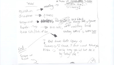
I got halfway into filming and had some free time as my actors weren't free, so I started editing when I started editing the footage I got so far. It felt like the narrative wasn't getting through the trailer and maybe I have filmed a too much. That's why I had gone back to basics and written down on paper Todrovs theory which applies to my trailer and matching scene up to the theory. This makes it clear for me to show and structure my trailer.

Then another problem arose where the first scene was too long.  So I had a look at The Vow trailer's first scene and Dear Johns trailer to see their first scene and it wasn't long so I made a decision to scrap my first idea of showing how my two love interest met in the library. I have switched it to where they meet in a Blockbusters. I personally feel that it would be a quick few shots and easier to show my narrative.

Another issue is that my actors aren't free, which delays filming. At this moment I am done
with filming and editing. All I have to do is get my male actor to do voiceovers and then I am done.
.
As I have countlessly explained, my narrative isn't panning out, so as I planned on having a scene in Blockbusters, I decided not to anymore. If I shot that scene,  it would be like if I was making a film, not a trailer. I think when planning the shots, I may have over planned and thought of doing extra scenes as if I was doing a film. 

Monday 24 September 2012

Overall Information on my project

To explain my project,
Genre
The genre I will be focussing on a hybrid genre, romance drama. As I like romance drama films, I feel that I can come up with a good romance drama storyline.

Target Audience
My target audience are mainly females. From the ages 15+. As it is a simple storyline, I feel that most teenagers would like a simple yet sweet romance drama to watch.
I tried to attract a male target audience too, however I feel it is very difficult to have the male audience watch and be intrested in a romance drama. There is something which doesnt attract men to a romance drama whereas it does attract the female audience.
Also the middle aged generation would like this film as it is about young people who have a normal life and have gone through something which can happen to anybody at an instant.
Also I am trying to attract couples as couples normally go see romance drama together and I want my trailer to follow that norm.

Friday 7 September 2012

My Promotional Poster Plans

This is my promotional poster plan. The pencil outline of the image isn't great when scanning, but this shows my two actors faces close to show the intimacy of the characters. I have gone with the idea of  'The Vow' poster. As I will be using a different image to show their love in the promotional poster, I can use another image in the magazine cover to show their love but in a different less intimate way. In this image I wish to use a white/ heaven background as it should show the intimacy. I have followed the trend where the institutions names are at the bottom of the poster which is combined with the release date for the film too, which will be in red to make the date stand out. Majority the image should be the only major attraction on the image rather than the name and that is what I've gone for.


This is my 2nd plan for my promotional poster. The image wasn't decided so I drew 5 ideas on the plan. The layout is different as I placed the film name at the top of the poster then the names of the characters at the bottom. I tired this because I wanted to see what it would look like if it changed.
The use of pink for the title was used because pink is a soft colour which should represent the love of my couple in the trailer. However as this is a synergy project I may use red as I have used red on the magazine poster too and see which one looks better. Also the same colour needs to be used in the trailer too. Overall I don't like the way the film name is at the top and actors name is at the bottom, so therefore I made another plan with what I would like my final poster to look like.


I combined what I liked in the first two posters and created a super final poster.
Again the layout I have followed normal promotional posters that I have analysed. Starting with the names of the actors at the top. I personally feel that it would look more professional and the audience would notice the actors if I have the names at the top. Then they would gradually descend to see the image then the name of the film with its tag line underneath then the institution information and the date of release within the details at the bottom. As I explained with the second idea, I have gone for a pink however I will trial a red as I have used red in the magazine which would show synergy. The image is drawn in pencil and not colour in because I am still hesitant on what image I should use, With the previous shots I will photography all 5 poses and see which one will suit the promotional poster and which one will deliver the right message across on the promo poster. Again with the other font colour I don't want to use black as it has negative connotations, so depending on the background I want to use a beige, creme font.


My Magazine Plans

Here is my first own draft of what I expect my magazine to look like, I have taken into consideration what my audiences expect me to use in this. 


The image hasn't been decided as I want it to fit and look acceptable for a magazine cover. However I have written some ideas for what I could have my main image as, the actors face close, a piggyback ride or the man in front and the women face behind. I am waiting for the photo shoot to decide what final image I shall use on my magazine poster. 
I want the the background to be white however like heavenly with bright lights so I will be finding a way to conduct the background with the colour scheme.
To explain my magazine,
I have chosen the colour scheme, red, black, white and yellow. I felt the red can connotate love in my cover as it is a romance trailer I am portraying. The use of black font is to make the font stand out. Originally I was going to use white font , however as I want a white background, I cannot use white font. With the use of yellow used on the cover, I have analysed from previous magazine covers that yellow stands out on covers which was the reason of use on my cover.
Lastly the use of the film reel at the bottom of the cover, I got as an inspiration from another magazine I Googled. I thought it was pretty interesting using a film reel to show what other stories will be involved in the magazine.
However to look at the overall plan, there's a lot of black used, which doesn't show my genre justice, which means making another magazine plan.


Here is my second draft, having more than one design could prove good as I have two designs to choose from in my finale cover.


This magazine has an image which I would like to use. As this is promoting my film as well as the actors in my film, I felt that a close hug would show the proxemics of the characters in the film and on the cover.
The title is red and the sub heading is red too. I felt that normally Empire covers have some sort of red on and as I am doing a romance drama trailer it fits perfectly with the genre as red connotates love and passion.
With analysing previous magazine covers, I have noticed that the costumes that the actors wear on the cover coordinate with the colour scheme used on the cover. As 'Empire' is in red, I will be having some sort of red on my actors and hopefully use some dark blue too.
My background in the photo will either be a white plain background which metaphorically will be heaven or a background which is blurred out. However font will be a major option. As I want to font to be clear and readable, I feel that colour is also important. As black would be readable however it gives off negative connotation such as evil, dark, mysterious. A dark blue font could suffice as blue connotates calmness and neutral.


Thursday 6 September 2012

Actors

In my coursework i have asked my a couple of my friends to act in my trailer as i can trust them to help me in my coursework.
I have chosen...

James to play Aaron one half of the love interests


Alisha to play Katie one half of the love interest


Jo to play Ashton Aarons best friend


Then here are some extras...


Monday 3 September 2012

Costumes, Props, Settings, Lighting list

This is my list of Costumes, Props, Setting/Location and Lighting which I will be conducting in my production of my trailer.
Props


Props #2


Costumes #1


Costumes #2


 Lighting


Settings/ Location #1


 Settings/Location #2


Story boarding

Here is my storyboards, I have done 17 pieces of A4 of story boarding. I have created in each shot what the shot would look like and underneath I have explained what will happen in each shot and how I want it to be editied. It is easier for to me shoot when the shots are planned. Also I have altered the first scene as the orginal first scene would be too long for a trailer.


Magazine Analysis- FilmFare (Bollywood)


I specifically found this magazine cover which is a Bollywood film magazine which had a couple on the front. As I am doing a romance, drama trailer, I wanted the analyse a magazine cover which has a couple as the main image on the front and see whether it is effective as other magazine covers are.
The colours on the magazine covers are bright and not dull at all. With the actors costumes are mostly blue and white, this allows the readers to know that they are a couple who are in a romance film for sure. I personally feel that the light colours on the actors are a positive way forward as this will be representing my genre well. With the colour scheme red, white and black, this follows the norm of a magazine colour. As a cover should have a colour scheme which follows the main image genre for example, as this image has a couple the colours red, white and black follow as this are the stereotypical colours of love. In my magazine cover I will also be using a colour scheme.
The font on a magazine cover is vital as this allows the reader the magazines name and main stories. As this cover hasn’t got fancy font, this indicated that I shouldn’t be using fancy font. However it should have my own touch to the font as it will be representing the genre. With the main story’s font different to any other font on the cover, this indicated to the readers that this is the main story which this magazine is covering. I like the fact that there’s distinct font between the main story and the name of the magazine and I will be using that idea in my magazine cover.
The main image on this magazine cover is very effective as this is the first thing which attracts the readers to purchase the issue. With an couple on the front of the cover automatically changes the norm of a magazine cover. Normally its is an individual shot of an actor however this cover has a couple as its main image. With a full shot the image the audience know what the main story is about. Also the eye contact from the main image is key. Also the smaller image has eye which allows the reader to feel important.
Language is very important on a magazine cover as this lets the readers know what the stories will be in this issue. With short snappy words like, ‘Love’s in the air’ as a slogan to the main image, allow the readers to get to grip easily with the main story. Also words like ‘Watch Out For…’ are great on the cover as this attracts the readers to know more about the stories, for example if there’s a new actor or a new film.  I will be using short snappy words on my cover as I want readers to be attracted to my cover.
On this particular issue, it has followed some of the norms of a magazine cover, with the magazine heading at the top then have the sub heading under the main image. Also having the website and date of issue underneath the heading, adding to the cover are the cover lines which are featured on the front. With only three cover lines, it is acceptable as this won’t crowd the main image and story. I will limit the amount of cover lines I use as they could crowd my cover. The barcode is in a different place, this acceptable however I personally feel it should be on the right of the cover. The cover also has a sky line, which is often found on cover as this gives the readers more information on other stories in the magazine. In previous magazine cover I placed my sky line at the bottom, however I will use the sky line this time on my completed cover.


Sunday 2 September 2012

Analysis of 'The Last Song'- Promotional Poster

The colours used in this promotional poster are simple for example at the top of the poster there’s a mixture of blue and beige. The blue represent the sky. With a touch of beige which represents the characters, it gives us the audience a sense that this film will be sweet and calm romance film. In previous research I found out that these sorts of calm colours are used in romance drama promotional posters and trailers. This gives the audience a sense of the genre. I personally feel that the use of soft colours is perfect for the genre as this gives the audience a sense of the specific genre, therefore I shall take this idea onto my promotional poster. Another thing I picked out in this promotional poster is that the transition in the background from black from the bottom to beige and blue at the top. The black would represent negativity/ drama in the storyline. Also it would represent the darkness which would be cast across the relationship of the love interests. Now onto the transition of colours in the background, this would represent the events throughout the film. The background is representing Todrovs theory. The disruption is represented by the black then the transition period where the black and beige mix is the recognition of the disruption then finally where it is fully beige it is repaired in the theory. Lastly onto a recognition of where the colours are placed on the poster. With the black at the bottom of the page it can represent ‘hell’. As ‘Hell’ is stereotyped at the bottom this can reflect the negativity in this drama. However where the beige and blue colours are located, this can represents ‘Heaven’.  This can also reflect on the happiness in the film. With the idea of ‘Heaven’ and ‘Hell’ playing in the colour schemes, the idea of a ‘perfect’ romance drama film is ideal via the poster.
The font in this promotional poster is simple and readable. Whenever I see a font like the one used in the promo poster, it reminds me of a very simple yet classy font and I think it gives the film an  ‘old school’ feel. With epic and classy romance films in the olden days, I feel the simplistic font is used to represent the ‘epic’ vibe to the film. With this analysis, I will be using the simple yet classy font in my poster as this will reflect my romance drama film.  
Image-
There are two images in poster which are major statements. Firstly starting with the main image of Miley Cyrus and Liam Hemsworth, the image is bigger than anything else on the page. This is a statement as this shows the viewers that they are the two main love interests. I would like to create a statement with an Image in my promotional poster. The image shows the love interests not giving each other eye contact and again from research, I have found out that eye contact through an image shows the love through the characters. And with a contrasting image below with the love interests hugging, close proxemics and eye contact, shows the genre created through images. Also the background is essential as it is a beach surrounding, which is also stereotypically romantic with the idea of a romantic stroll on the beach.  Lastly the main images of the two actors are represents as match made in heaven. With the idea of matches made in heaven, it is represented through the image. With old saying represented through images is very smart and I would like to try one out in my own poster.
The layout on the poster is very original as it sticks to what a promotional poster should look like. With institution information on the lower page and the date of release to the lower page, this allows the viewers to have the right information stuck to their mind. Then with the main image near enough at the centre of the page which again attracts the views to who is in the film, then having the films name below the main image.  Sometimes some film posters have other information at the very top of the poster. For example in this one, it shows who the film director has worked on before, as this allows the audience want to see the film even more. With it written, ‘ from the authors of The Notebook and A Walk To Remember’ allows audience members to think that, ‘’we should see this film because the other films were epic romances’’. With such reputation from previous films placed on a new film, it allows audience members to make quick judgements on new films.
The language part of the promotional poster is very simple as it shouldn’t be hard to read. With the film title, the institution information and the actor’s names on the promotional poster, it would never go wrong. However with other information like slogans, allows the audience to gather more information on the film. I personally feel that I will be adding maybe a slogan onto the promotional poster which allows my audiences to gather more info too.